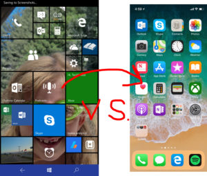
I have been a “Microsoft phone” supporter for nearly 10 years. From Windows Mobile, to Windows Phone 7 in 2010. To the betrayal that was Windows Phone 8, forcing all Windows 7 users to upgrade to new hardware (and the new OS). All the way through Windows 10 mobile and to it’s ultimate discontinuation, I was faithful and believed in the movement. Loyal to the end, and beyond, I have now chosen my next mobile platform, and I’ve sided with Apple.
Yuck! Just saying that I am an iPhone-user now grosses me out. It’s not that iPhone users are nasty, or that popular things are bad. And it’s not that Apple doesn’t make great devices, they do. It’s that for so many years, I’ve been using a constantly-evolving, modern mobile Operating System (OS). And now in many ways it feels like I’ve taken several steps backwards
It’s also frustrating that I’ve watched Microsoft create brilliant, useful features; and then seen Apple claim them as their own.
Apple is a better imitator than an innovator
Apple would have you think that they invented the mp3 player. They didn’t. The reveal of the iPad Pro tried to pretend that Apple was the first tablet with a keyboard cover and a stylus. What?! Microsoft Surface says hello. Anyway, here’s a few examples of where Apple lifted from Windows Phone for the iPhone.
Live photos
In 2014, as part of the Windows Phone 8.1 “cyan” update, Lumia 1020, 1520, and Icon owners were introduced to a new type of photograph, called “living images”. Users would take a photo like normal, but if there was motion detected, the camera would save a few seconds before the photo was snapped. It was a neat way to put images into “context”, and allowed for saving images from before the photo was taken.
iOS “introduced” this feature 15 months later and claimed it as new. Windows Phone users stood mouth agape as Apple copped yet another page from the Microsoft playbook. It shouldn’t surprise anyone anymore, but at the time, it still stung.
Face scanning
My new iPhone X has the ability to scan my face and use it for unlocking my phone, authorizing purchases, logging into LastPass, and more. It works amazingly well, almost instantaneously. At least it’s bringing good food, because it is late to the party.
A full two years earlier, Lumia 950 and 950XL owners were utilizing iris scanning. It required putting the phone closer to your face than the iPhone X does, but it worked well.
Sadly, this feature never left open beta, and was never refined on mobile before Microsoft pulled the plug on its mobile division. At least face scanning on Windows 10 still rocks.
3D touch
Another “first on Windows Phone” feature, 3D touch actually never made it to market. It was tested in 2014, but the phone that used it was cancelled, probably due to poor sales across the Windows Phone landscape.
It’s worth noting that some of Apple’s more innovative features were on Microsoft platforms 2 years prior.
What sucks about switching from Windows Phone to iPhone
Coming from Windows Phone and Windows 10 Mobile, there are features that I will miss. Apple has some good stuff packed into the iPhone and its ecosystem, but I need to address its shortcomings first. Some of these issues, I’m sure I will get past in time. Others will haunt me perpetually, or until Apple fixes them. We can only hope for the latter.
The Keyboard
I hate the iPhone keyboard, and I want you to hate it too.
Apple’s broken Caps-lock
Apple “born and raised” users will likely not even notice this. They just think it’s how it’s supposed to be. The iPhone “Craps-lock” is utter trash.
Here is how a Caps-lock is supposed to work:
- user enters Caps-lock, sometimes with a double-tap of the shift button.
- all letters are now upper-case until user turns off Caps-lock or exits keyboard.
Pretty simple, really. Now let’s see Apple’s take on this function:
- user enters Caps-lock with double-tap of the shift button.
- all letters are now uppercase.
- user presses “123” to enter some numbers or a special character.
- user presses “ABC” to enter letters to find that Caps-lock is OFF!!
Every other software keyboard in existence (unverified) works as intended, but not the iPhone’s. Could you imagine having to babysit your Caps-lock on your Mac or PC when entering case-sensitive passwords? We wouldn’t stand for it. But Apple has somehow managed to get by like this for 10 years.
The reason this is infuriating is that this takes special care to mess up. In computer programming, a variable will hold it’s value until it is changed or reset; unless it’s a local variable. Local variables are created and destroyed as part of a function call. Either Apple lazily left the status of Caps-lock as a local variable, or they foolishly chose to reset it every time you change tabs in the keyboard. “Grrr” either way.
Common punctuation marks on a different page
I may be alone in this regard, but I actually use punctuation. If all you ever do is type “brb” and “k bye”, than you might not notice the lack of a comma (“,”) and period (“.”) on the main page of the iPhone keyboard.
You need to go to “123” in order to type these special characters, and if you are typing an email address, it’s a particularly annoying omission.
There is a slight reprieve in that tapping and holding on “123” will let you hover over the punctuation mark you want and release, which will print it to the screen.
(Swiper!), no swiping
Apple’s iPhone is missing Swype/word-flow/swipe typing. That’s where you drag your finger around the letters in a word and the predictive text algorithm types the word you meant (most of the time).
It’s absolutely fantastic when it works. It makes typing with one hand (even blindly) viable. Thanks to my selection of the iPhone, I now have to use both hands to text, like some kind of savage.
No Back Button
Android devices and Windows Phone (and it’s derivatives) have a “home” button and a “back” button. This allows for apps to all have the same navigation location for “going back”, returning to a previous screen, or viewing a previous section.
iPhones have no such button. This requires app developers to “create their own” back buttons. Many developers have different ideas about how a user should return to a previous screen. And this is a source of frustration for new iPhone users like me. I had no desire to play “how do you go back in this app”. Sometimes it’s at the top, sometimes it’s at the bottom. Sometimes you have to click the upper left, sometimes you have to click “Done” in the upper right. It’s a mess. You’d think in ten years they could have come up with a better solution. But then you remember the keyboard.
The Home Screen Icons
In ten years (sorry if this is getting old, but this is getting old), the iPhone home screen icons have changed…almost not-at-all. If it weren’t for the fairly recent addition of groups, I might call this system broken as well.
Coming from Windows 10 Mobile, I was used to “pinning” my most used icons to the start screen. This was similar to how Windows 10 desktop and its Start screen work. I could download a hundred apps, but only the ones I cared most about were pinned to the Start screen. The remaining apps were sorted alphabetically on a different screen a swipe away.
Now that I am on the iPhone, I apparently have to get used to downloaded apps plopping themselves down on the home screen, whether I want to see them or not.
The benefits of switching from Windows Phone to iPhone
There are some fantastic perks to being an iPhone user, and it would be unfair to neglect mentioning them.
The Apps!!
The main reason Windows Phone lacked as a platform was apps. Any new platform needs apps to draw users, but developers don’t want to make apps unless there are users. Catch-22.
Apple has cultivated their walled garden well, and the apps have flourished. Both Android and iPhone have all the apps you could want. And while it’s great to have a fully functioning Instagram, the iPhone has some apps that I think are the bees knees.
GarageBand
As a musician, the iPhone seems to be the right place to be. Apple has invested considerably in making the iPhone a destination for musicians on-the-go.
GarageBand is pretty epic. It lets you record into the microphone (or enabled hardware) your real instruments, and add virtual instruments of your choosing.
GarageBand is actually a pretty complete portable DAW (Digital Audio Workstation). You have tools to add plugins, compression and EQ. It’s possible to mix the volumes of tracks and create loops from recorded or programmed material. There is even a sampler for recording sounds in the world and triggering them like an instrument.
It’s a great program for tinkering with musical ideas away from your primary workstation. But’s also entirely possible to create entire tracks in GarageBand.
Music Memos
Dang it, Apple! You did it again.
Music Memos is a surprising little app for jotting musical ideas. It’s nowhere near as powerful (or complex) as GarageBand, but its simplicity is its strength.
With only a guitar and my new iPhone running the Music Memos app, I record a chord progression or idea. What happens next is something magical.
After recording the idea, you can play back your recording, but this with the option of adding drums and bass. But these aren’t simple backing loops. Music Memos detects what chords you played and the tempo you played them and puts astonishingly fitting drums and bass parts in to accompany you. You can disable either or both with a tap or two.
As a demo, I recorded my daughter strumming the ukulele in the back seat while driving down the freeway, road noise and all. Music Memos picked up her chords and her tempo and played mostly-appropriate parts. The drums even sped up when she did. It’s like a virtual band in a box. I’m impressed.
Siri > Cortana
Mostly, that is. I miss Cortana’s voice. Siri sounds stupid and grating at the default setting to me. But Siri is, on the whole, more useful than Cortana.
Cortana responded well to abstract phrases, like song and video game titles. But Siri has a more “natural language” approach. I asked Siri how the weather was in Los Angeles, and she answered. I then asked “What about San Francisco?” I didn’t rephrase the initial question, I just asked like I would ask a human who understood the context. Siri answered with a current forecast of San Francisco. Well done!


I know I will have to face all of this at one point….definitely a bit scary! Thanks for all the heads up info and here’s hoping that Apple picks up the pace and fixes shortcomings sooner rather than later.
Not having been anything except an iPhone user for the last 8 years. I found your commentary very interesting and informative. Thanks 🙏🏿